When it comes to content marketing, it’s safe to say that looks definitely matter.
Think your audience is shallow? Maybe. But the truth is that online, our attention spans just aren’t that long. The content of your article might get them to your page, but good design, largely, is what will keep them there.
We get it, the last thing most of us want to do after writing a 2,500-word blog post is to take the extra time to perfect all of our formatting elements. But what if I were to tell you that far from being some superficial waste of time, these small changes are things that are absolutely essential for your blog’s success?
No joke. Putting in the extra time to format your content matters. Especially if you’re publishing long-form content. It can truly be the difference between visitors who convert into leads, and readers who get bored after just a few words.
Your blog should look inviting, uncluttered, and be easy on the eyes. Keeping these things in mind can not only help to expand your readership, but also help you earn social shares and backlinks.
Failing to format correctly, on the other hand, can drive your audience away –and fast.
The good news is that top-notch formatting doesn’t have to be difficult or especially time-consuming. Once you have a set format for your blog, putting it all together is actually pretty easy.
And, as a bonus, at the end of this post, I’ll even provide you with a step-by-step checklist to creating the perfect blog post, as well as a download sheet that you can get that’ll spell the whole process out for you!
The fact is, the act of conceptualizing, researching, writing, and publishing high-quality content is the most time-consuming part. But separating your content into easy-to-digest chunks –really can be done in as little as 15-30 minutes.
I’ve sharpened my pencil and put together the most on-point tips found around the web for making your content user-friendly, readable, and oh-so-sticky!
Read on to see the best of the best!
Create an Attention-Grabbing Title
“Shocking ways to lose ten pounds,” “You won’t believe what she’s doing now,” “The secret to wealth-building that no one’s talking about.”
There’s a reason headlines like this exist: because they work. Your title’s goal is to get your readers to click on it. It should pique their interest, and make them to want to learn more. When creating your article, it’s important to ensure that you make your readers want to learn more –but don’t make the mistake of overselling. There’s no point in getting them to click your headline, if they’ll just click away when they realize the content isn’t as exciting as promised!
The best headlines are honest, exciting, specific, and bold. Often, they make use of numbers as well. Many people find that it’s best to start writing with a working title in mind –a draft, if you will, and then tweaking it once the article’s finished.
Use Short Paragraphs
To be an effective writer, you’re going to have to throw out half of what you learned about grammar in school. Online writing is a whole ‘nother ball game. The first thing to go should be your paragraph size. You will no longer get gold stars for complex, long paragraphs. Keep em short, keep em succinct.
Neil Patel agrees, and recommends grouping your thoughts into brief sections. Most readers leave a web page after just 10-20 seconds, so make your writing scan-able. You should be writing in a conversational voice. We don’t speak in ten-line monologues (usually!), and you shouldn’t be blogging in them either. A good rule to follow is to include 3-5 sentences per paragraph and be sure that each paragraph covers only one concept. This can be tough at first, but old habits die hard my friend.
When composing the perfect blog post, in many ways, it pays to throw caution to the wind. Traditional rules of composition do not always apply. Don’t be afraid to break from tradition if it’ll help you get your point across or improve readability.
Use Lists
Don’t kid yourself. You love lists. We all do. As proven by the rise of the listicle (list-based article). That’s because nobody reads anymore, they skim. And to the skimming eye, lists stand out. Whether or not you format your entire blog as a list (listicle anyone?), or just look to include bullet points throughout, by listing your data points in a scannable fashion, you can help to convey important messages to visitors who are likely skimming your article. Just to prove my point, a list of my top reasons to use a bullet point list:
See, they do get your attention!
Look, they’re easy to scan
They present your points in a simple yet effective way!
Use Plenty of Images
Readers looooove pictures! Not only do images help to break up your copy, but they also help to increase engagement on your page as well. Ideally, you’ll want to include an image or screencap every 300 words or so on your blog post. This will add more visual appeal to your post, and provide readers a rest periodically to look at something more interesting than a wall of text. And it doesn’t have to just be images either –an infographic, screenshot, embedded video, or meme can all work to catch the eye of your readers.
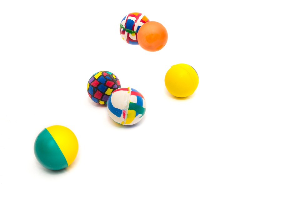
Focus on choosing photos that are real, tangible, and convey something specific to the reader. Don’t be afraid to get uber-creative here. Just because you’re writing an article on ‘bounce rates,’ for example, doesn’t mean you need a screenshot of Google Analytics. Why not a photo of someone on a trampoline. Or even some bouncy balls? Clever right?
 “What are your bounce rates like?”
Another example could be a post about a Skype interview you had with Kanye West (as you do!). Instead of grabbing Kayne’s profile from his Twitter, why not screengrab a screenshot from your Skype video chat and use that instead? With his permission of course!
Should you ever use stock photos?
The answer is with care. There is a good stock photo, and a funny stock photo, with no room in between.
Now, I’m not saying that you should never under any circumstances EVER use a stock photo, just that you should recognize that they’re not all equal. Marketing experiments conducted in one study found that photos of actual employees have a 95% higher conversion rate than stock photos. The conclusion was that there’s nothing inherently wrong with stock images, however, there is a problem with pictures that don’t look believable.
Take these two photos, for example. Each meant to represent “teamwork.” I would say one is definitely more appealing than the other. Be aware of the message you’re conveying, a picture is worth 1,000 words remember?

“Which one of these stock photos actually says “teamwork” and which one looks like some sort of weird corporate séance?” Justin Kerr writes in his article There’s no excuse for using bad stock photography. “Natural lighting, natural placement of people in space, and natural interactions make all the difference between these two examples,” he says.
Avoid padding your blogs with pictures of smiling models tapping away on their MacBook Pros, especially if they are out of context or look too fake. Instead, rely on images that fit and further the message of your article.
Stock photos can be great for memes on Reddit. But just remember, an image is only as valuable as the value it communicates. If a stock photo doesn’t add anything unique to your post, then it doesn’t communicate any important piece of information.
- Include Images of People As humans, we are naturally wired to connect with others. Including images with a human element in your posts is a great way to help draw people in. Look to include photos of people, especially ones that feature faces to help make your articles more engaging.
- Add Keywords to Image File Names Format your images like this: this-is-a-great-keyword.png. You’ll also want to compress them down to a reasonable file size. Overly large file sizes slow down page load speed –and are especially problematic on smartphones.
- Use Image Captions Whenever it’ll help to add clarity or context, look to include captions with your images. While people may only skim your article’s body text, they’re likely to look at the photos and thoroughly read the captions. So take the time to write captions that fully explain both the photo and the key idea represented in the photo.
Make It Bold
The battle of the bold. The only thing more controversial in the blogosphere is italics. Or maybe bold italics! At the end of the day though, the key message is the same: whatever helps you get your key points across –as long as you don’t frustrate your readers in the process, of course.
Naturally, you’ll want to avoid using bold, italics, or bold italics too frequently. We like to go by the advice of Sean McCabe in the Supercharge Your Writing course he suggests only bolding a phrase if it is something that you would Tweet out to your followers. So use bold, but consider saving it for your best, most Tweetable lessons.
Use Headings
If you haven’t caught on by now, good blog formatting has a ton to do with making your content skimmable. And yes, headings are also a perfect way to create skimmable sections of content.
By breaking your post into sections with different headings, readers are able to quickly scan to find the section they’re interested in reading. Or they can get the gist of the article, and decide if they want to dig a little deeper into it.Take this post for example. We have broken up each tip into its own section with a helpful heading. Even if you aren’t reading this text right now, you can still see at a glance what my top tips are.
Use Subheadings
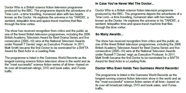
When your points can be broken down into smaller sections, you’ll want to use subheaders! Subheaders are skimmable, and allow your readers to easily track your thoughts with you .Just look at the remarkable difference in the image below, courtesy of SearchEngineJournal, where the same content is displayed both with and without subheaders:

It’s a no-brainer. The section on the right is much easier to digest. Whenever possible, be sure to use keyword-rich subtitles, as it will give your content appeal to both readers and search engines.
Include Links
Don’t forget to format your links. Use natural, conversational anchor text (the text that’s hyperlinked). Ensure that your readers understand what they’ll find on your destination page when they click a link. Mix up the internal and external links –that is, link to your own content and other people’s content as well.
Show your readers related content on your own website, and link out to authoritative sources that support your post. When formatting your post in WordPress, make sure links are set to open in a new window. That way users won’t be taken away from what they’re trying to read. And finally, avoid using entire sentences as anchor text as it tends to look sloppy.
Soundbites
Soundbites are little quotes that are able to be Tweeted or shared on social media. You’ve no doubt seen these yourself on various articles before. These quotes include a “click to Tweet” button that makes it easy for your readers to share some of your key thoughts with their followers on social media. They help to break up the text a bit, and as a bonus can also help you to get more traffic from social media as well.
Include a CTA
Finally, don’t forget to include a good CTA at the end of the post. What would you like your reader to do next? Where should they go from here? Your CTA could be something simple, like asking a question at the end of the article or encouraging your readers to share their thoughts, or it could direct them on to another piece of content.
For content that’s targeting prospects that are a bit lower in the funnel, you may consider prompting them to take the next step and subscribe. Finally, for very warm prospects, you could prompt them to consider your product offering. Your CTA should make sense and be a clear and natural progression on from your article. Above all, make sure it doesn’t feel forced, contrived, or pushy.
Some Fast Formatting Guidelines
We have also put together a quick go-to list for you. This includes a few items we didn’t cover in the above guide.

- Sentence Length
Shoot for 25 words or less per sentence. - Image Placement
Try adding one image every 300 words or so. - Paragraph Length
Ideally, paragraphs should be about three sentences or fewer. - Word Count
This one is entirely up to you. A good rule is however long it takes to make your point. - Usage of Header Tags
Use one H1 header for your headline, H2 tags for sub-headers, and H3 tags for points beneath sub-headers. Use header tags H4 through H6 sparingly. - Flow of Information
Have a clear introduction, body, and conclusion.
Be sure to download your FREE bonus content sheet for even more tips on creating the perfect blog post!
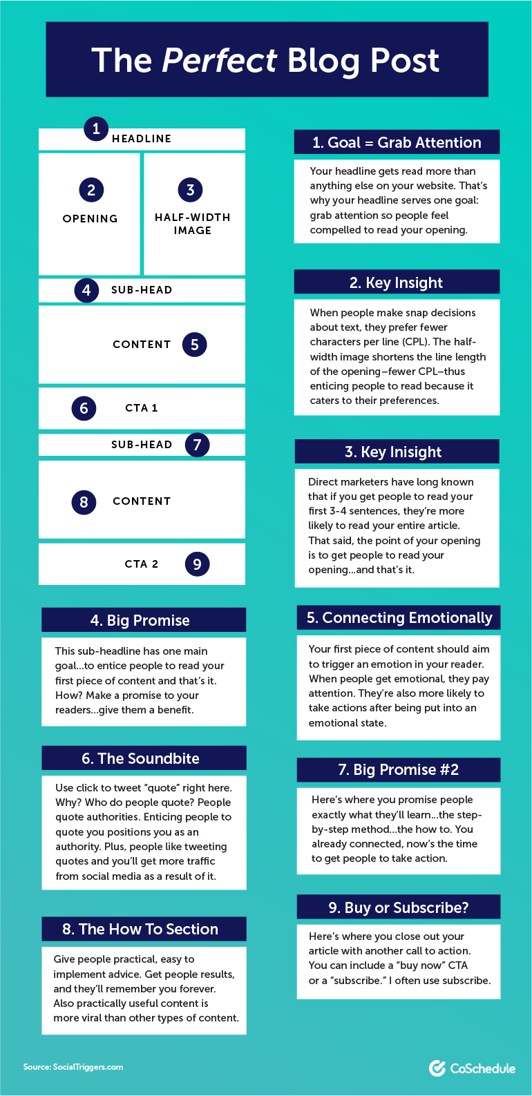
Finally, as a bonus, take a look at this diagram by CoSchedule –for an easy-to-follow guide when formatting your own Perfect Blog Post:

While your content doesn’t have to follow these guidelines to the letter, this diagram certainly is a good place to start.
Don’t let all your hard work on researching and writing an article to be for nothing. Taking a little extra time when you’re done writing to tighten up your format can go a long way in improving the performance of your content.
Sure, looks don’t matter nearly as much as what’s inside. But by taking the time to polish up your format a bit before it goes live allows you to put your best foot forward, helping you to get your audience’s attention, and ultimately, draw your readers in –for the long-term!
So take a deep breath, relax, and go write that perfect blog post! We’re rooting for you!
What’s YOUR idea of a perfect blog post?


